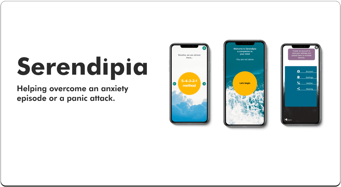
Serendipia
Designing a
mental health app
Summary
The content design of mental health apps doesn't consider when a person is having a crisis moment.
I addressed the wide-scope problem through interviews with patients and SMEs as with secondary research.
The solution considered accessibility, easy-to-use design, and adapting to any environment.
Methodology
Competitive analisys
Interviews and secondary research
Usability test
Heuristic evaluations
Role
UX Research
UX designer
UX Writer/Content strategist
UI design
The problemMental health apps don't consider a person's journey through a mental crisis episode.
Most apps offer solutions that rely on stable moments, dismissing the user journey regarding why they seek help in a mental health app.
The solutionWith proven techniques, create a tool to help people with anxiety or panic disorders find mental relief.
I designed an app thought for emotional crises. Its human-centered design allows the user to find comfort easily and effectively thanks to the techniques they are familiar with.
The processI needed to understand how to bring mental relief to some conditions ethically and effectively.
To do this, I create the following strategy:
I researched studies about mental health, interviewed users and SMEs, and looked into the
competitive landscape to gather insights on how to approach the pain points found.With the data found, I discarded some assumptions to design solutions using artifacts such
as personas and storyboards.Mapping the user flows and testing them to validate the prototypes created.
At first, there was a larger list of disorders, making it challenging to address the solutions; interviews with SMEs narrowed the scope to anxiety and panic disorders without compromising the ethical guidelines.
Mapping and testingMicro-usability testing of the wireframes was essential to secure a simple and engaging process.
The feedback helped identify weak points to fix, from the user flow to the content design itself.
10
Participants took part in the initial test
Participants report uncertainty in the onboarding process and problems with the writing due to uncertain labeling.
The data gathered helped refine the prototype. Performing heuristic evaluations and other tests helped correct the user experience, from how people understood the instructions to the emotional level they showed with the experience.
15
Participants in the next round of testing
(Vía Preely)
The outcomeAlthough the result is more intuitive, the content must even ease the mental burden.
Interactive content can be more engaging: watching/hearing a video is more accessible than reading in a critical situation. Besides using cards instead of buttons in the mental strategies section, it allows a browsing style instead of a searching one, helping the user to recognize a more standard model nowadays used in other user experiences, making it more efficient.
Doing more research and testing on a more senior population could result in new ways to improve the system's usability before adding more mental disorders that can reach more people in need.
Here you will learn about my UX research, (including methodology) and UX writing process.
Here you can learn about my content strategy process.


